
Clackd Social Platform
Product Design • Product Strategy
Clackd is an online platform that aims to bring the mechanical keyboard community into one location. I helped lead a team of designers and developers to bring this vision to life.
The Problem
A group of keyboard enthusiasts had come together and identified the need to centralize all things related to the hobby of mechanical keyboards. At the time, resources for beginners were scattered, buying and selling was conducted in outdated forums, and there was no easy way for an individual to showcase their entire keyboard collection. The solution was to combine all aspects related to this hobby into one. Although I came on board to help with development, I saw a need to revisit the established designs of the platform and to help define a process that would enable us to create the best possible experience for our users.
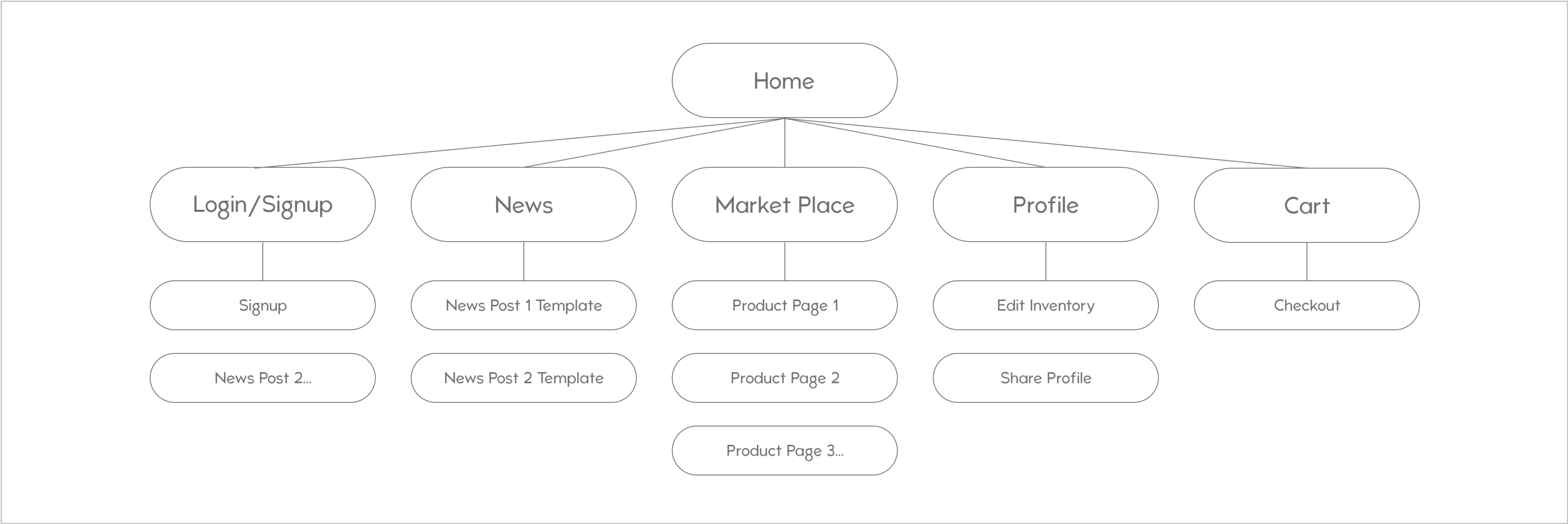 The sitemap when I joined the project - missing key user flows and focusing on a marketplace rather than a community
Reassessing the Journey
My first plan of action was to ensure that I fully understood the target audience. I identified three key personas: the enthusiast, the new enthusiast, and the new consumer. Their traits, behaviors, and major pain points helped drive the areas of the platform we would focus on first. With similarities between the groups in struggling to find a central hub of information and resources, I determined there was a need to provide a robust product database. This key feature would also help to establish the groundwork in allowing users to showcase their builds and provide us a playground in which to craft resources for newcomers and veterans.
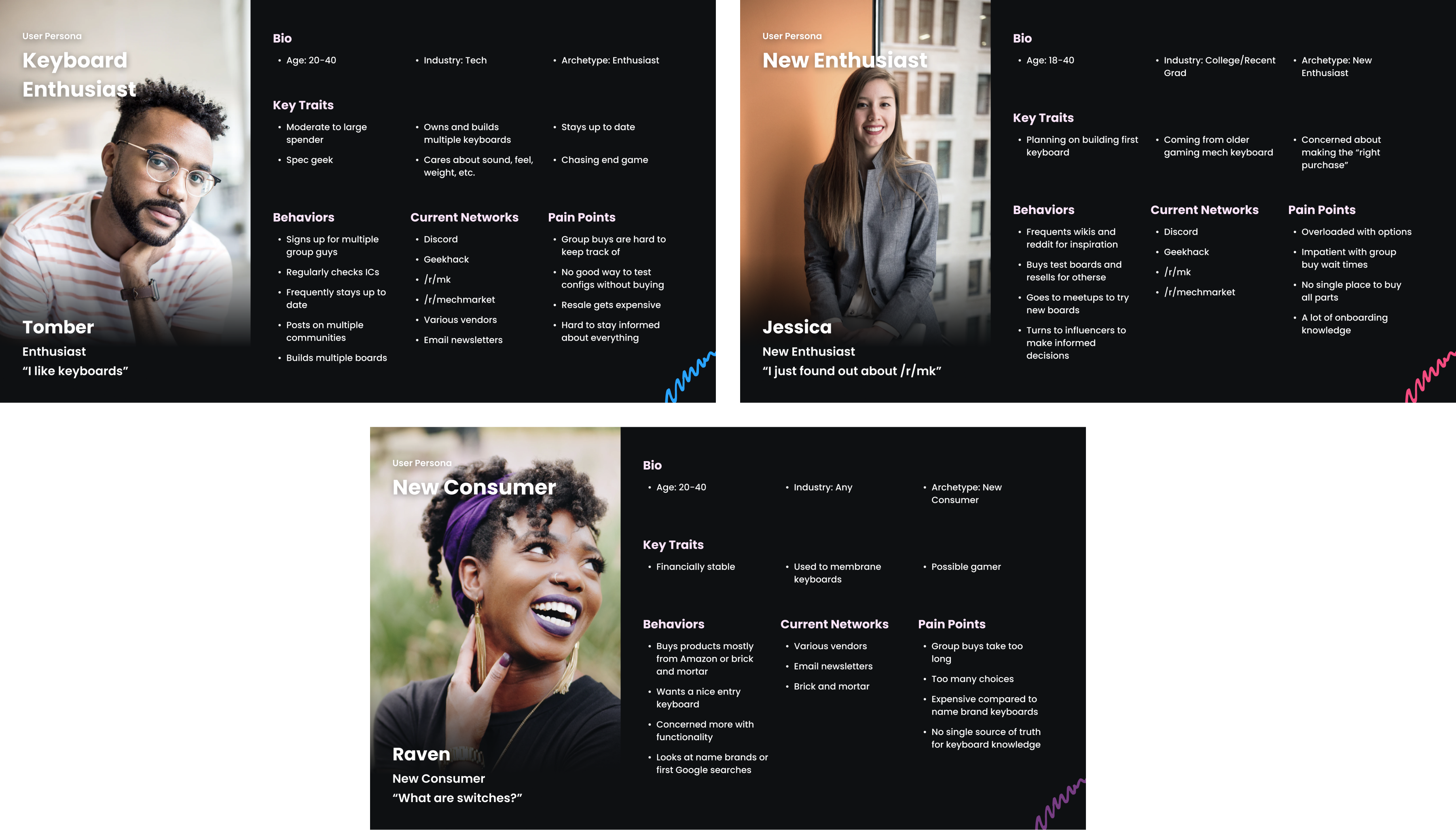 User personas
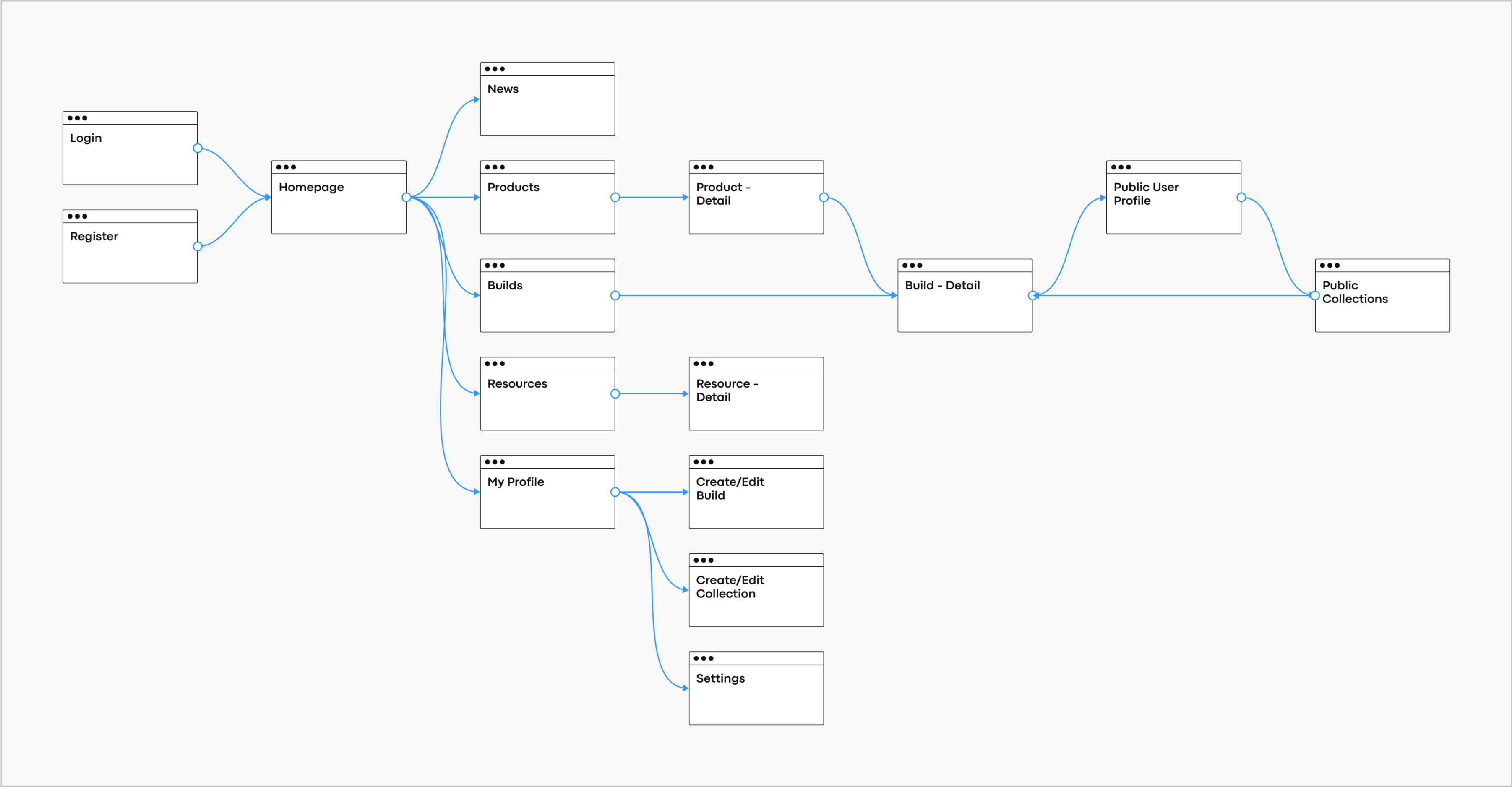 Revised sitemap that removed the marketplace and instead placed emphasis on resources, a product database, and showcasing user builds
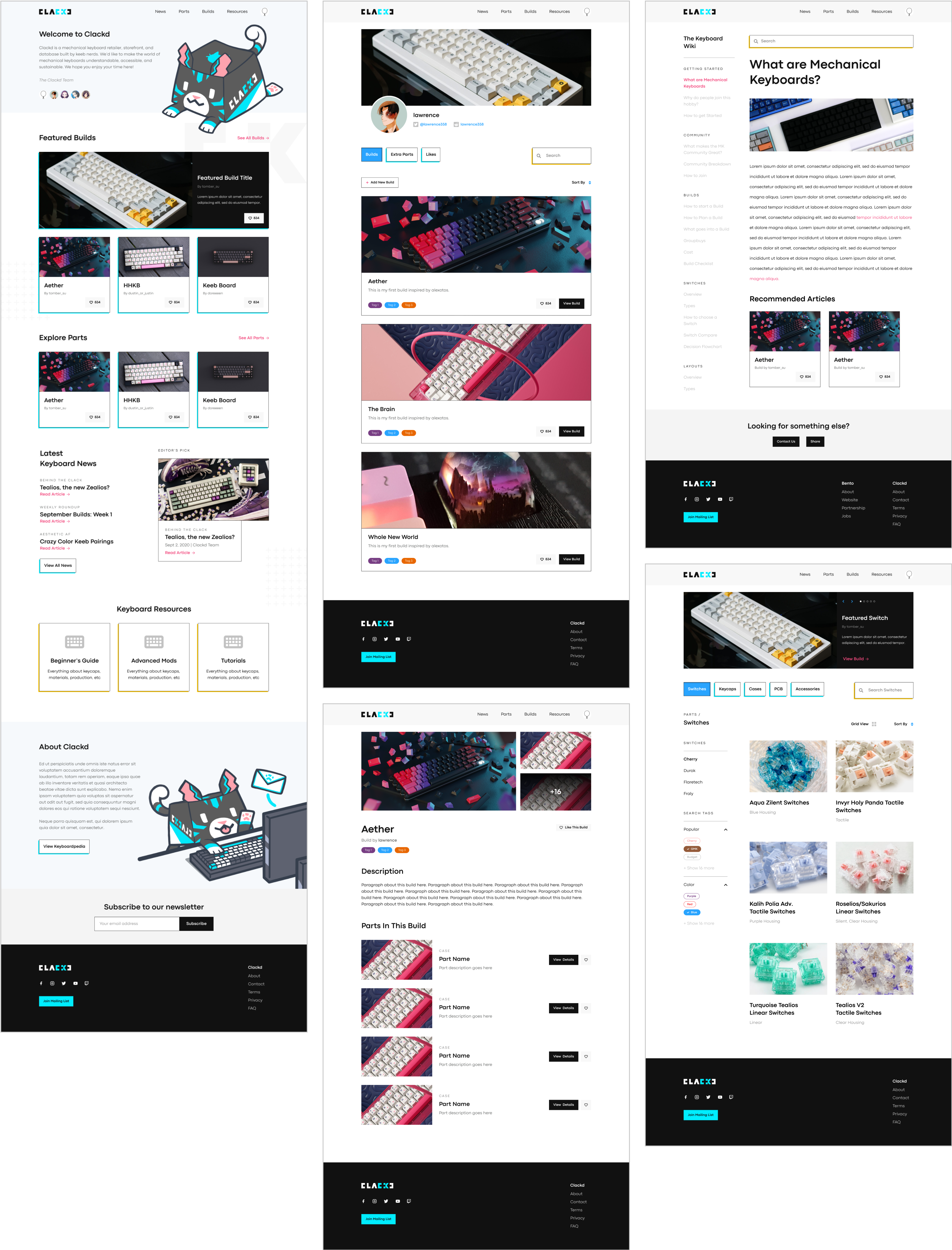
Functional Design
The next order of business was digging into the user experience. As I reviewed each page, I identified areas of improvement in terms of UX best practices and design consistency. One example of introducing changes was on a page that allowed a user to submit a build to their profile. The existing method was an embedded form that would let users add custom slots featuring any part of their build. Although customization and uniqueness are usually desired traits, I believed we should keep the user focused and instructed on what they could add to their entry. The result was a guided form with clearly defined sections, allowing free-form text when appropriate and autocomplete search fields where necessary.
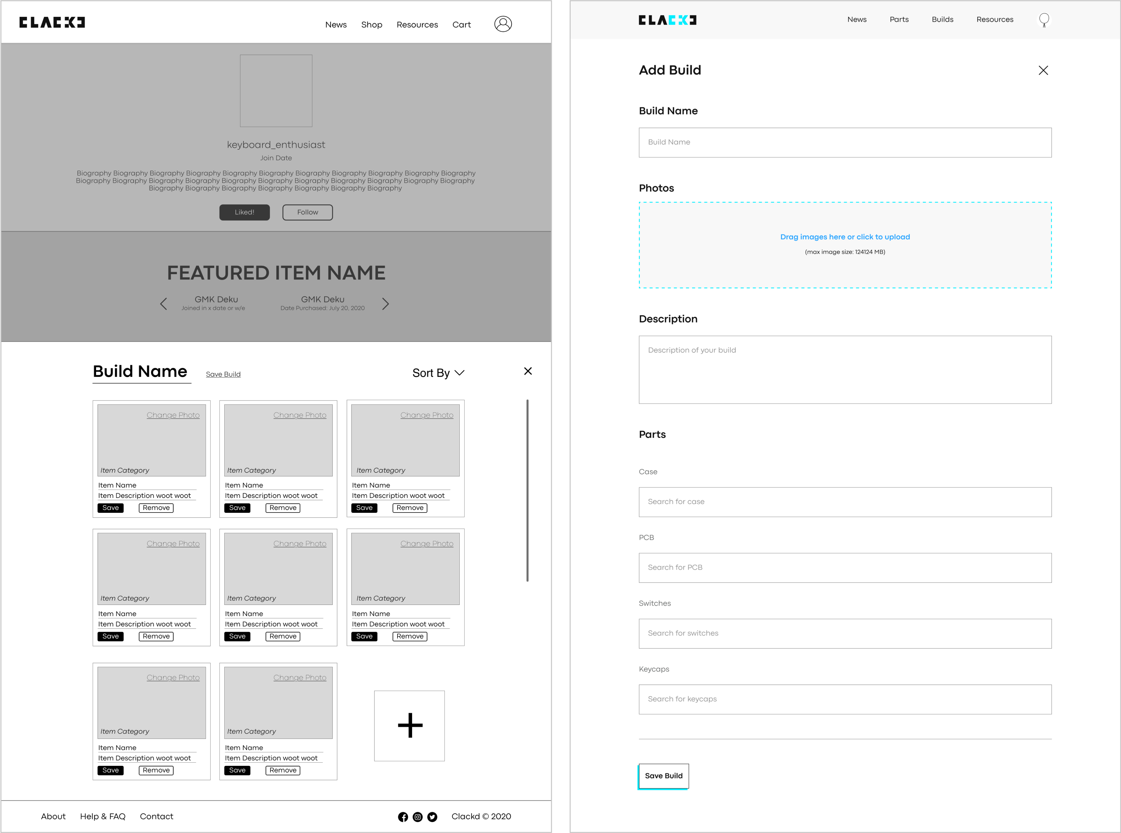 Adding a new build before and after - providing a guided form for the user
Visual Language
"My final plan of action was to establish a visual direction for the platform and to utilize this language consistently throughout the designs. I worked with the brand team to establish a color palette, font, and illustrations, and filled in the remaining gaps with core website components that would live on all the pages. After aligning on a direction, this allowed me to create a design system and style guide that accelerated the overall process. Though the design system is constantly changing and growing, establishing reusable components was an important part in moving and adapting quickly.
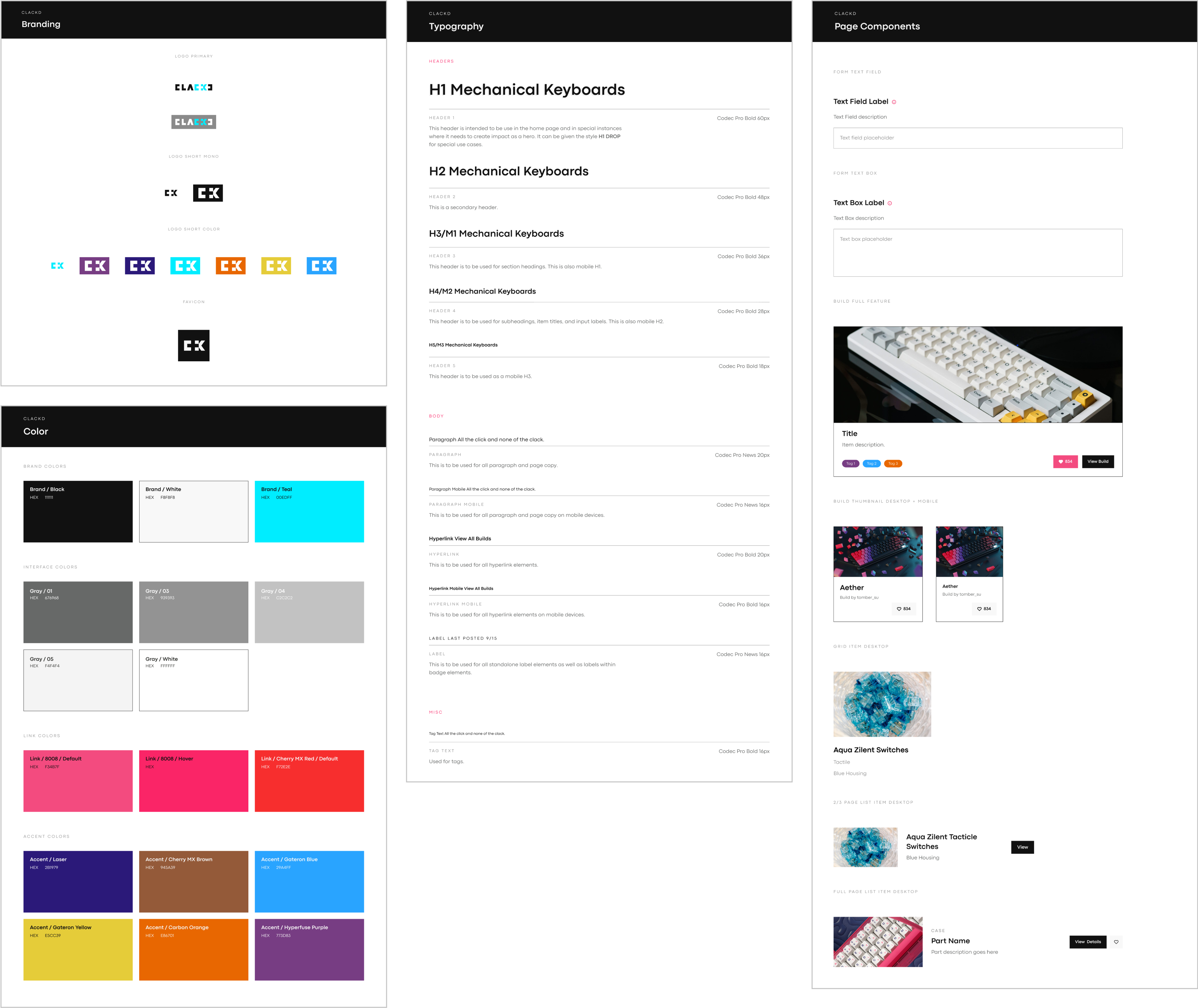 A sample of style guide components
The Result
After working with product to understand our core offerings, brand to align on a visual language, and development to facilitate design delivery, we launched an MVP experience to a group of testers to help capture feedback. Though the platform is still in its infancy, we celebrated the launch of building something from ground zero through tight collaboration and shared ideas. The feedback we received confirmed that the product was feasible to create and was something desirable from the community.
Learnings
Building something from scratch was tremendously exciting and came with many learnings. Here are a few of my takeaways
- Design file organization is important for both designers and developers of the team. I would receive the occasional question of where certain files were located but also questions regarding the state of designs - whether they were in progress or ready for development. I have since created a highly modular labeling system using Figma components on all my design projects to establish proper communication and organization while working with team members.
- Don’t be too ambitious in designing everything as part of one large scope. The development team ended up recalculating their velocity and determined it was best to scope down and re-establish the project in multiple phases. In hindsight, I would have liked to implement this for the design team as well so that we could slow down and ensure there were no gaps in what we were creating.
- Don’t de-prioritize designs of varying screen sizes. I had placed an emphasis on desktop designs while re-imagining the experience and defining the visual tone. This caused our team to lose sight of how the experience would function on mobile devices. Moving forward, designs for all screen sizes take an equal priority and dedication so that the experience is consistent across the board.
Thank you for reading! Check out some of my other projects using the links below.
